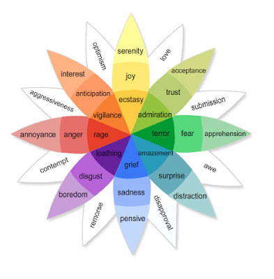
Emotions and Life: Perspectives from Psychology, Biology, and Evolution
Author: Robert Plutchik
When one stares at a single color (red for example) for a
sustained period of time (roughly thirty seconds to a minute), then looks at a
white surface, an afterimage of the complementary color (in this case cyan)
will appear. This is one of several aftereffects studied in the psychology of
visual perception which are generally ascribed to fatigue in specific parts of
the visual system.[1]
In the case above the photoreceptors for red light in the
retina are fatigued, lessening their ability to send the information to the
brain. When white light is viewed, the red portions of light incident upon the
eye are not transmitted as efficiently as the other wavelengths (or colors),
and the result is the illusion of viewing the complementary
color.[clarification needed] As the receptors are given time to rest, the
illusion vanishes. In the case of looking at white light, red light is still
incident upon the eye (as well as blue and green), however since the receptors
for other light colors are also being fatigued, the eye will reach an
equilibrium.
[edit] Art and design
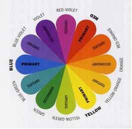
a Blue-Yellow-Red color wheel. Opposite colors are called
complementary.
Because of the limited range of colors that was available
throughout most of the history of art, many artists still use a traditional set
of complementary pairs, including:
* white and black
* red and green
* blue and orange
* yellow and
violet
The complement of each primary color (red, blue, or yellow)
is roughly the color made by mixing the other two in a subtractive system:
* red complements
(blue + yellow) = green
* blue complements
(red + yellow) = orange
* yellow
complements (red + blue) = violet
When two complements are mixed they produce a brown, or, in
the case of black and white, a gray.
The use of complementary colors is an important aspect of
aesthetically pleasing art and graphic design. This also extends to other
fields such as contrasting colors in logos and retail display. When placed next
to each other, complements make each other appear brighter. On an artistic
color wheel, complementary colors are placed opposite one another. Although
these artistic complements may not be precise complements under the scientific
definition, most artistic color wheels are laid out roughly like the HSV color
wheel discussed above. http://en.wikipedia.org/wiki/Complementary_colo
No comments:
Post a Comment